

Inspirational Rebranding and Repackaging from Top CPG Brands
In the CPG food and beverage space, packaging plays a pivotal role in attracting consumers and conveying brand identity. A well-executed repackaging campaign can breathe new life into a product, revitalizing its presence on shelves and capturing the attention of potential customers. On the other hand, an unsuccessful repackaging campaign can result in lost time, money, and revenue.
In this article, we'll explore ten examples of successful repackaging campaigns that have successfully captured a new audience or reinvigorated a brand, along with a few cautionary tales of missteps in the process. We'll also explore next steps to consider when contemplating a repackaging endeavor.
Why Repackage Products?
There are a variety of reasons that brands may want to repackage products. Refreshed packaging often comes hand-in-hand with an updated brand image. When brands refresh to stay relevant in the market, packaging designs may need to be updated with new logos, typography, or color palettes. Even subtle changes can signal to buyers that the brand is remaining innovative in the food and beverage landscape.
Brands may also need to enhance their communication regarding their product. Conveying product benefits, ingredients, and usage instructions may require a brand to update packaging to refine messaging and align it with consumer preferences. Additionally, consumer demographics and preferences can shift over time, necessitating brands to adapt packaging to appeal to new target customers.
The retail space continues to be a competitive landscape, meaning brands need to stand out in the crowded environment. Updating packaging to better stand out amongst other products can catch consumers’ eyes and give products an edge in the marketplace.
With growing consumer awareness about environmental issues, many brands are also prioritizing sustainable packaging solutions. Repackaging offers an opportunity to transition to eco-friendly materials, reduce packaging waste, and communicate the brand's commitment to sustainability.
Challenges of Repackaging
When considering the challenges of repackaging, there are two primary themes that the challenges fall into: logistical and marketing.
Logistical challenges are those that impact you internally and are not influenced by your consumer base. For example, cost is considered a logistical challenge. Repackaging products has costs associated with design, material sourcing, production, and distribution. It’s important to do a thorough return on investment comparison to ensure the investment will see a return.
Other logistical challenges include supply chain disruptions and regulatory compliance issues. Having to source different materials for your packaging may cause delays in production or may require additional work to ensure materials are compliant with labeling, product safety, and environmental regulations.
While logistical challenges tend to be internal facing, there are also challenges that can be faced when repackaging is launched into the market. It’s essential to strike a balance between innovation and maintaining brand recognition, ensuring that brands are not alienating new customers with a drastically different design. Consumer response can also be unpredictable, further pressing the importance for market research and feedback mechanisms to gauge the effectiveness of new packaging.
Examples of Successful Repackaging Campaigns

LaCroix
LaCroix had fallen into the status quo when it came to sparkling water packaging in the early 2000s. To portray the idea of clean and pure, water companies across the market were leaning heavily on clear or blue bottles and simple fonts. In 2002, G Heileman Brewing Company, LaCroix’s found company, was acquired by National Beverage Corp. and Alchemy Brand Group was asked to redesign the packaging.
Bringing LaCroix to the creative forefront was going to take bold, risky moves. Alchemy Brand Group wanted to combine the existing brand of LaCroix - fluid, effervescent - with how they desired to position themselves in the market: as a soda alternative. This pivot made it easier to break the unspoken rules of water packaging.
Strong color blocking allowed the brand to stand out on shelves and also enabled the brand to subtly change the color to denote the flavor. The cursive typeface was a drastic departure from what was seen in the market, adding another distinct element to help the brand stand out.
Alchemy Brand Group provided a few options to the executive team at National Beverage. In a twist of fate, the option that was least liked by executives was the most preferred by consumers during market testing. National Beverage wanted to honor the research and opted for the less-liked design, giving us the distinct packaging we know and love today.

Dave’s Sweet Tooth
The pivot from online sales to retail can be a daunting one, as experienced by Dave’s Sweet Tooth. With a loyal online following, the brand did not initially need to consider how its packaging would display amongst competitors. The original packaging, both plastic screw cap jars and kraft paper die-cut pouches to resemble jars, aligned well with the brand’s vision and voice.
However, as Dave’s Sweet Tooth prepared to launch in a retail environment, they recognized that the existing packaging didn’t communicate the product well enough, nor did it tap into the story of what drives the brand.
Wanting to honor the existing jar-shaped packaging, design firm Catalpha retained the general shape, but opted to include more detail about each product. New custom photography was added for each flavor that highlighted key ingredients and each flavor had a unique color palette to differentiate them from each other. The new packaging also added new communication about what consumers could expect from the flavors.
The ability to highlight flavor cues, share the small-batch story of Dave’s Sweet Tooth, and provide visual distinctions between each product propelled this product to stand out on shelves.

RXBAR
Protein bar brand RXBAR is all about straightforward ingredients. Unfortunately, their packaging wasn’t capturing the attention of gymgoers as the brand had hoped. In the opposite of Dave’s Sweet Tooth, RXBAR packaging originally included different flavor cues for each bar. In this instance, flavor cues were common across health bar packaging, making it hard for RXBAR to stand out on shelves.
The brand needed to modernize its packaging in a way that represented its commitment to better-for-you ingredients and its tagline, “No B.S.” They opted to instead use color cues for each flavor and list the ingredients on the front of the packaging, along with its tagline. The colorful approach and direct communication make the RXBAR packaging stand out on shelves.
One important consideration for the wellness food space is the claims that brands may want to include on the packaging. Legal teams must work to identify if the claims can be made for the product before including it on any packaging.

Just. (Hampton Creek)
Hampton Creek opted for an entire rebrand that included distinct changes to the packaging. The vegan company had used simple packaging previously but went even further in its minimalistic approach to the brand.
First, the brand pivoted to a new name: Just. The approach further propels their mission of being a clean food brand that focuses on simple ingredients. In addition to the name change, the packaging includes a single visual element, often an ingredient or a swatch of the product itself.
Just. went all-in with their straightforward packaging. It aligns well with their company values and speaks to their mission - to provide consumers with delicious vegan products.

Starbucks
Starbucks is one of the most recognizable brands in the world. The green siren that adorns coffee cups is a sure sign of a delicious beverage on the inside. While the siren always made an appearance in the logo, there have been some subtle, but powerful, changes.
Initially, the Starbucks logo included the siren, surrounded by the words, “Coffee Tea Spices.” For many years, the brown color palette and the words described the brand’s aspirations and business goals. Around 1987, the brand modernized the siren and removed the words tea and spices from their logo. The new language let Starbucks position itself as a coffee-making powerhouse.
In 2011, Starbucks fully committed to its redesign. In order to position the brand as more than just a coffee shop, the company dropped all the text around the logo, giving them the chance to even further expand their product range. While the logo retains the most recognizable aspect, the siren, there has been a conscious pivot to a more inclusive logo that takes into account future ambitions.

Jello
Repackaging household brands can be a daunting task. It’s important to keep the brand recognizable for consumers while ensuring that your packaging reflects your constantly evolving brand. This was the challenge faced by Jell-O as it shifted its long-time packaging designs.
For 10 years, Jell-O packaging had remained the same. Visuals of the product, flavor cues, and a few key product communications have adorned packaging for years now. In collaboration with BrandOpus, the snack food giant is leaning into the nostalgia that has remained a large part of its brand.
Gone is the gradient background in favor of color blocking, flavor cues for fruit flavors only, and a bold new typeface. The combination of nostalgia and modernizing comes together for really approachable packaging that won’t alienate an existing fanbase.

Minute Maid
Capturing nostalgia seems to be a theme for many repackaging campaigns, including for Minute Maid. The breakfast beverage brand made some minor adjustments that actually fulfill two major goals.
As with many brands, the resurgence of nostalgia has encouraged brands to streamline logos and packaging. Minute Maid removed their iconic green gradient band in favor of a 2D black logo. In contrast, the typeface was updated to be more modern, using a more rounded font to bring a more casual feel to the brand.
Additionally, this was a global rebrand for Minute Maid. With products launched all over the world, Minute Maid wanted to ensure that regardless of travel, consumers knew how to find their favorite orange juice. This perspective demonstrates Minute Maid’s global approach to business and a desire to unify the many iterations of the brand.

Oikos Greek Yogurt
The diary aisle doesn’t tend to be a space for striking packaging. Pastels, delicate fonts, and many product-on-spoon action shots adorn the yogurt section. For many years, Oikos fell into this same pattern, blending into shelves.
Oikos needed something to break them out from the sea of competitors, which was accomplished with their repackaging. The brand stepped into bold fonts and colors, looking more like something in the health food aisle than the yogurt section. Oikos moved away from many of the cliches seen in other yogurt packaging, instead creating packaging that appeals to a wider range of audiences.
The new packaging is clean, includes bold typography that stands out, and clearly communicates both flavors and product differentiators. Oikos used the homogenous packaging of competitors to their advantage to make noticeable waves.

Superfrau
It’s also possible that packaging is communicating too much to consumers. This was the trap that Superfrau fell into with their original packaging. The brand knew its differentiator was the primary ingredient, whey. However, due to a lack of consumer knowledge outside of the fitness community, the focus on whey was alienating for potential consumers.
For their repackaging, the brand leaned away from the standard health food beverage and focused in on a more soda-like appearance. Bold colors and typography, playful graphics, and the use of a can make this product much more approachable for audiences.
The brand also diversified its packaging communications. Packaging still touts the key differentiator - whey - while including other information that consumers can more easily connect with, like the inclusion of electrolytes and B-12. The fun approach to the packaging allows for lots of whimsy while still presenting as a better-for-you beverage.

Daring
Daring is an interesting example of improving on already great packaging. The original packaging popped, easily drawing the eye of potential consumers. The typeface was modern and the packaging didn’t overcommunicate information. There was nothing inherently wrong with the packaging, but there’s a good chance it wasn’t connecting with the right audience.
Switching to a less colorful palette and more sophisticated typography, the packaging is now targeting an entirely new section of the market. The packaging still remains modern but is clearly more geared towards an older audience now.
Daring put great thought into their target audience with this packaging redesign. It has the potential to open up an entirely new customer base that would otherwise be less willing to try plant-based chicken.
Less Successful Repackaging Campaign and What Went Wrong
Tropicana
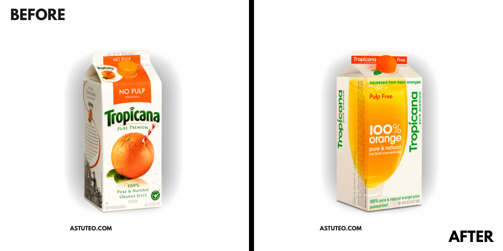
Tropicana is a great example of why market research is important in repackaging. The brand tried to modernize its look by updating the graphics and typography of the packaging. The problem was that Tropicana removed its most iconic imagery: an orange with a straw sticking out of it.
Tropicana shifted to a cleaner graphic of a simple glass of orange juice on the packaging. In theory, the modern approach to the repackaging was similar to what many other brands were doing, trying to shed their older feel. The original, very obvious display of “freshness,” was so recognizable to consumers that when it was replaced, Tropicana saw a 20% drop in sales over two months.
The repackaging was so detrimental to the brand, it actually reverted back to the original packaging design. Had the brand conducted market research on their repackaging, they could have saved themselves both time and money.

Sierra Mist
While Sierra Mist has since been replaced with Starry, it did see poor repackaging at one point in time. Another example of why market research is important, Sierra Mist rebranded due to formula changes and an attempt to establish itself in the market.
Sierra Mist briefly rebranded as Mist Twist, creating confusion among consumers. With no communication regarding the repackaging, audiences were unsure if it was even the same product. The change in name, along with the change in ingredients that was communicated on the packaging, created a disjointed product that kept consumers guessing.
What do those successes have in common?
First and foremost, every brand with a successful repackaging campaign had a clear goal. Whether a new customer segment, standing out amongst the competition, or realigning with new company goals, these brands walked into their repackaging campaigns with an understanding of what they needed to accomplish.
Many of these brands also conducted market research to confirm their findings. In some cases, the market research provided entirely different answers than expected, leading to more successful repackaging efforts. Remember that your consumers dictate the success of your product and you want to keep their preferences in mind.
Finally, engage with the right partners. Many successful repackaging strategies are developed by incredibly talented agencies that have years of experience in the industry. Even if you have a powerhouse creative team internally, don’t be afraid to engage with other experts to receive a fresh opinion.
Next Steps If Considering Repackaging
There are some definite steps you’ll want to consider when investing in repackaging:
Clearly define the goals of both your business and the repackaging campaign.
Conduct market research and analysis to understand consumer preferences and competitor packaging strategies.
Involve your legal department or a legal consultant to ensure your brand remains compliant with all relevant regulations in your industry.
Collaborate with experienced designers and packaging experts to create innovative and visually appealing packaging designs that align with your brand’s identity.
Develop prototypes and conduct thorough internal testing on their functionality, aesthetic, and consumer appeal.
Work closely with your manufacturing partners and suppliers to ensure a seamless transition to new packaging materials.
Develop your marketing and communication strategy to not only drum up excitement but also clearly explain to consumers the new packaging.
Launch your product and continue to evaluate the performance of your products in the market.
Repackaging can be an exciting time in a brand’s lifecycle. As you develop your brand more clearly, it’s important that your packaging reflects your evolution. With the right strategy and tactical approach, you can successfully realign your brand packaging with your identity, vision, and future aspirations.
Julee Ho Media is a boutique photography company specializing in CPG, food and beverage brands. Click here to get a quote and discover how we can help elevate your brand.
Continue learning:


Want more content like this? Subscribe to our monthly Food Marketing Newsletter!
More resources: