2020 has unfolded a whirlwind of twists and turns that have tested nearly every CPG business. And while it’s always been a tough battle for food and beverage companies to win over retailers to carry their products, even the triumphant few found their goods pushed to the wayside as the Targets, Walmarts and Amazons of the world focused on paper goods and sanitary products during the height of the pandemic.
Meanwhile, wholesalers who once relied on the hospitality industry felt the trickling effects of restaurant closures happening worldwide. What was once on the business “to-do list” became a reality that required immediate attention: the direct to consumer online shop.
Many of these eCommerce shops popped up seemingly overnight. Yet, many businesses are still learning how to navigate this new terrain. As a company that almost exclusively serves CPG brands of all sizes, we wanted to help. And so, we’ve done a bit of research, as well as, gathered insights gained from clients who’ve done an incredible job in their eCommerce stores, to provide you with the following best practices to help you excel at selling food and beverages online.
1. Make Buying Easy
A golden rule in sales is to never inconvenience the customer. And while you cannot interact with an online customer the same way you would in a brick-and-mortar shop, there are many ways to ensure they have the best shopping experience possible.
The first way to do this is to make buying easy. As soon as a visitor lands on your website, there should be a clear and easy way for them to buy your product. Just take a look at the Good Foods homepage below. Notice how the most noticeable buttons at the top are call-to-actions that direct the visitor to buy their products (either in store or online). One click leads you directly to the online store.
Secondly, you should link to or show variants of your products on similar product pages. For example, if you have fruit-infused chocolate bars that come in a variety of fruit flavors, folks should be able to easily see the raspberry and orange flavors while on the cherry flavor’s page.
Next, be sure to have easy payment options for the visitor to choose from, such as all major credit cards and debit. If possible, avoid anything that requires them to create an account. Doing so creates an added layer of friction that may indeed inconvenience the customer. Buying should be a breeze!
Lastly, offer free shipping if possible, or, bake the shipping costs into the cost of your products. That way, the customer isn’t faced with an unexpected fee right before they’re ready to complete the buying process. You don’t want anything causing hesitation or doubt during this critical experience of converting a visitor into a customer.
2. Create Compelling Copy
The messaging on your website should compel the visitor to take action and buy your products. That’s why you need to take advantage of the “screen real estate” you have at your disposal. Now, that doesn’t mean you should write paragraphs and paragraphs of text explaining why your product is so good. In fact, you should do the complete opposite. Most people won’t read most of what’s on your website and they are highly deterred by long bodies of text. So you must take that psychology into account when writing your copy. Be clear, concise and to-the-point.
Take a look at how simple the copy is on REBBL’s website. No header or subheader is more than one sentence long. Yet, you know exactly what they’re trying to communicate. Great copy writing is very much an art!
As you write, you must also be highly conscious of your ideal customer profile (see the “Create an Ideal Customer Profile (ICP)” section here). These are the characteristics of the people who are (or you want to be) most likely to buy your products. Put yourself in their shoes as you write the copy for your site. What do they care about? How will this help them? In what ways will this make their life easier? Your copy should empathize with these folks in a manner that makes them feel like you’re speaking directly to them when they land on your site.
Ok, so what should you write about? Well, your website and eCommerce store’s copy should reflect all of the following.
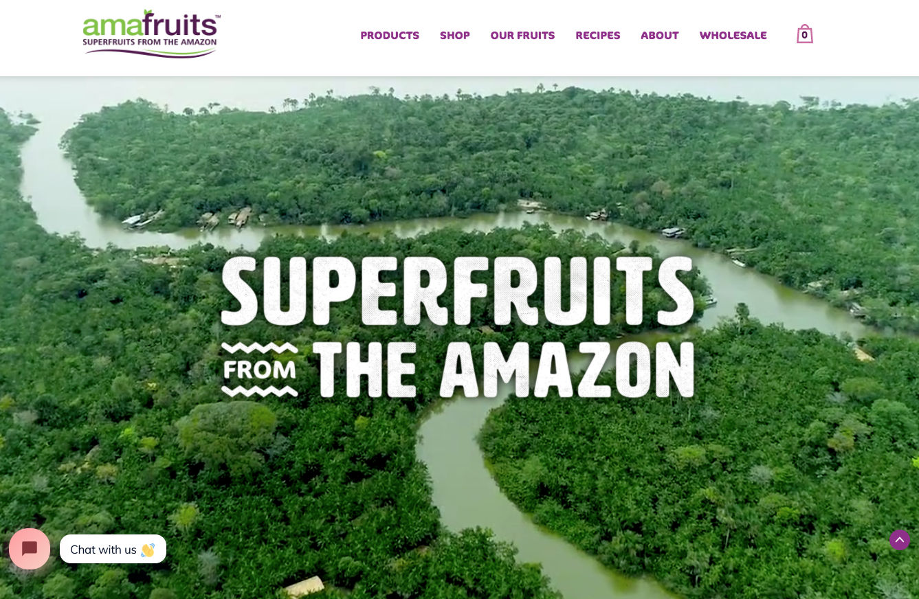
Who you are and what you do/sell: This needs to be immediately identified when a visitor lands on your website (that means in the top portion of your homepage). So, without the visitor having to scroll or click anywhere, they should know, in one or two sentences, what your company does and sells. Take a look at Amafruits’ homepage below. I don’t think there’s any confusion about what they do or sell!
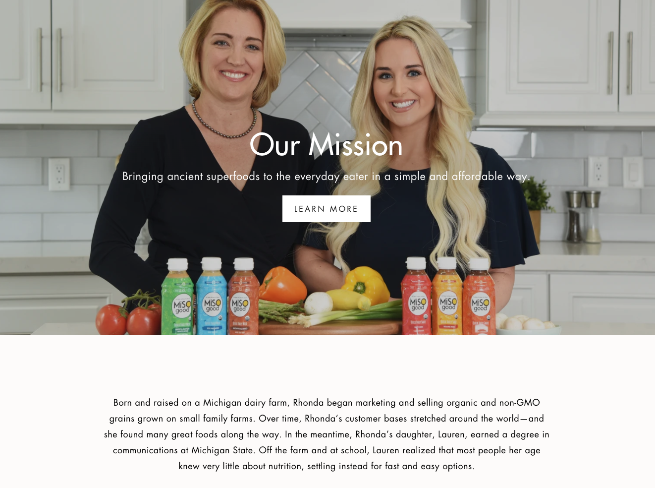
Why you do what you do: The why is important because folks want to know about the people behind the brand. This is the human element that helps people relate to your company, understand why they should care, as well as, why they should buy and support your company. This can be done in a short blurb on your homepage and/or on a separate, dedicated page. Take a look at MiSOgood’s founders’ story below. Their photo, the story of the mother-daughter team, and mission forms a lasting impression.
What makes you different: Your product is unique and special. You know that, but the visitor might not. It’s your job to communicate what sets your company and offerings apart from all of the others in its category. Throughout your site and online store, talk about the benefits of consuming your product, how it tailors to various diets and lifestyles, or how it helps local farmers or causes that you and others might care about. Popchips highlights their differentiators in a bold way on every product page as shown below.
Ingredients and selling points: We are fortunate to live in a time of great awareness around what we put into our bodies. That means people care more about ingredients than ever before. Is your product organic, non-GMO, free trade, etc.? Make sure you highlight those traits. Moreover, list every ingredient used in your products so folks can determine if it properly fits into their diet. Below is from Forager Project’s website. They care about the ingredients that go into their plant-based products and it shows!
3. Use High-Quality Visuals
You’d be hard-pressed to find a strong brand in any vertical that does not have a well-designed website with beautiful graphics and top-notch photography. In the F&B space, it is even more important than ever before. Why? Because without in-store tastings, photography is the closest thing potential customers have to understanding your products’ value before making a purchase. And if they don’t believe you invest your brand, they will assume you don’t invest in your products either. Quality of brand translates to quality of products.
Spend one second on Halo Top’s website and you will see this point demonstrated well. This company is known for their stellar visuals, pops of color and creative imagery.
It’s not only the quality of the visuals that matter, it’s also the consistency. For example, Bones Coffee (shown below) also has beautiful imagery on their website. However, if Halo Top began pulling in that style of visuals sporadically onto their website, the inconsistencies will show. It’s important to establish a style of visuals (see “Craft a Brand Kit” here), with your team, designer and/or photographer, and stick to it to achieve a level of consistency that is integral to building a strong brand.
Consistency is evermore important when it comes to your eCommerce store or “Shop” page. As this page typically displays a grid of your offerings, a lack of consistency will be particularly apparent on this page. Take a look at Quest Bar’s Shop page below and notice how cohesive their product display is.
Once you get to the individual product pages, a few different types of images would bode well:
Image of the product in-packaging: Shows potential customers how they’ll receive the product
Image of the raw/unpackaged product: Shows potential customers what the edible product looks like
Image of the product being used or prepared: Shows potential customers how to use / enjoy the product
In some cases, points 2 and 3 can be displayed in the same stylized image as shown in the Hudson Green example below.
4. Show Social Proof
Do people like your product? What do they like about it? How do they enjoy it? The answers to these questions can all help you make sales in your online store. Again, this taps into psychology by utilizing “herd mentality” to influence buying behaviors. In other words, people like to join in on things others are already doing. And when you combine that with testimonials from people who are similar to them, it becomes an even stronger influence.
There are a number of ways you can highlight fans of your products in a manner that boosts conversions. Firstly, you can display it on social media through text overlay on posts, in the captions, or simply through the number of followers you have (high number of followers indicate many people like what you’re dishing out!). Secondly, you can do it through fans and influencers, such as customers posting images and videos with your product or through food bloggers who use your products. Thirdly and most importantly, you can show testimonials directly on your website and eCommerce store.
But how do you get these testimonials, you ask? If you have an Amazon shop, you can grab the reviews from there. If someone tags you in a social media post or comments that they love your products, reach out to them directly and ask for a testimonial. You can promise to show only their last initial for privacy reasons if they’d prefer. Or, for those who want the extra exposure, you can offer to tag them in the post featuring the testimonial so they can gain followers, too!
Below are just a few of the reviews featured on Angelic Bakehouse’s website.
5. Offer Online Support
There is no business that cannot be improved with great customer service. To circle back to our original sales strategy of never inconveniencing the customer, offering online support will help ensure your visitors need not go far to get the help they need. At the bare minimum, you should have an easy (one-click) way for folks to reach out to you via email or a contact form and respond to their inquiries within a day.
Even better, include a chat bubble on your site where they can connect with a customer service representative with any questions. Perhaps they want to know if you ship to their area, sell gift cards, or they’re having trouble checking out – this quick access to help will streamline their buying experience and help you boost online sales.
Below is the chat box available to anyone visiting Jeni’s Spendid Ice Cream’s website to ensure they have the most seamless shopping experience.
6. Inspire Through Recipes
Recipes can be leveraged as a content marketing strategy that can set you apart from your competitors. To prove this point, let’s take a step back and consider the two types of CPG products out there: 1) those in well-known / established categories; and 2) those breaking into a new / unique product category. Each presents its own set of problems when it comes to marketing and selling.
If you’re a company in the first bucket, your challenge is to convince people that your products are unlike any of the other seemingly similar products. Take Bubbies, for example. Bubbies sells pickles, sauerkraut and condiments. None of these products are new to the world. However, they are truly unique in the quality of ingredients and superior taste of their products. So in addition to messaging these attributes in their marketing efforts, they also deliver value through recipe inspiration via social media (as shown below) and on their website. What this does is that it keeps their products consistently top-of-mind the next time someone needs pickles (not to mention builds their brand presence and credibility as a source for good food finds).
If your company lands in the latter bucket, you have a different barrier to overcome – obscurity. As a brand new product in a brand new category, people likely don’t really understand your product. They may wonder what it is, how it tastes, and in what ways they can use it. If they can’t grasp it, they certainly won’t buy it. Offering recipe ideas helps you tie your product to something people know and love, while providing value through cooking inspiration and educating the customer on how to best enjoy your products. Brazi Bites is a fine example of this. Their core product is Brazilian cheese bread. And while they are utterly delicious, not everyone has been fortunate enough to try them and, therefore, may not understand them. To help people make the connection, Brazi Bites offers loads and loads of recipe ideas on their website. One example is shown below – we may not all know what Brazilian cheese bread is but avocado toast is a crowd favorite!
7. Promote Incentives & Discounts
Offering promos is a great way to exchange value with your audience, gain first-time customers and create a fun shopping experience. Examples of incentives and special offers might include:
Discount for email newsletter signups
“Refer a friend” incentives
Buy X get 1 free offers
Free shipping for purchases over $X amount
Holiday and birthday offers
Money back guarantee
Earn points for every purchase
Free samples
In one example, Goodpop, offers a 10% off discount for folks who sign up for their newsletter. This is a great way to offer their customers value while allowing them to collect emails and keep in touch with these folks in the future!
That’s a Wrap
The best part of having your direct-to-consumer business is that there are no rules when it comes to how you choose to market. Working through retailers and online marketplaces is great but they come with many restrictions and parameters in terms of how you can message your brand / products and communicate with potential customers. And while launching, maintaining and succeeding in eCommerce is no easy feat, doing so unlocks tremendous potential for growing your business and reaching your customers!
Julee Ho Media is a boutique photography company specializing in CPG, food and beverage brands. Click here to get a quote and discover how we can help elevate your brand.
Continue learning:
Want more content like this? Subscribe to our monthly Food Marketing Newsletter!
More resources:


